Presentations have long been a powerful medium for conveying information, engaging audiences, showing information in visual ways, and leaving a lasting impact.
However, there’s something of an art to creating effective slides that takes careful consideration of design, content, and delivery. Here are some of the main presentation do’s and don’ts to keep in mind for the next time you’re in front of an audience.
1. The do’s
Know what you’re doing
Before diving into slide creation, clarify to yourself what the purpose of the presentation actually is. Think about what you want to achieve, who’s going to be presented to, and the key messages you wish to convey. This may seem obvious, but having a plan before diving in can really create a better flow of information.
Use visuals
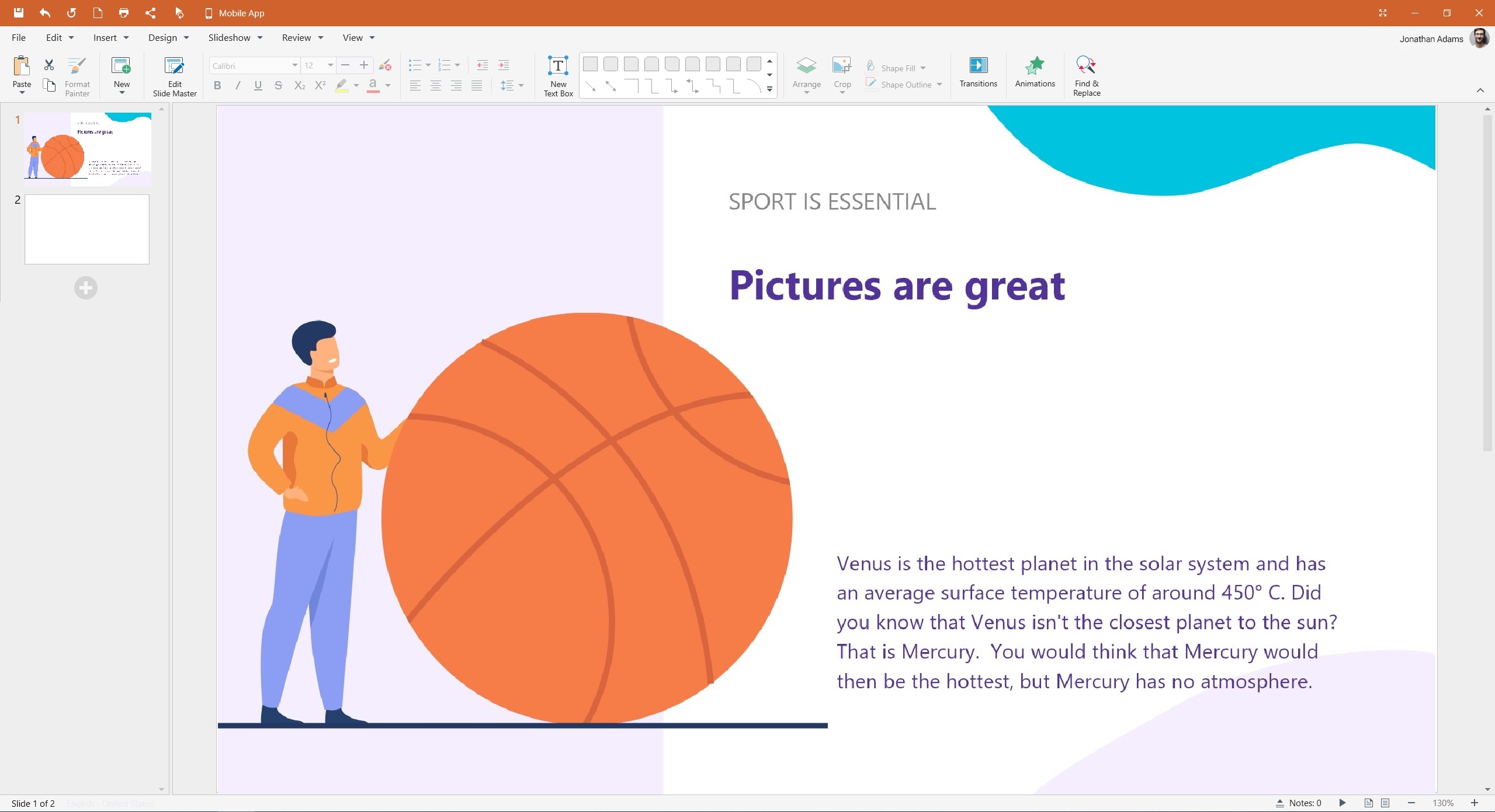
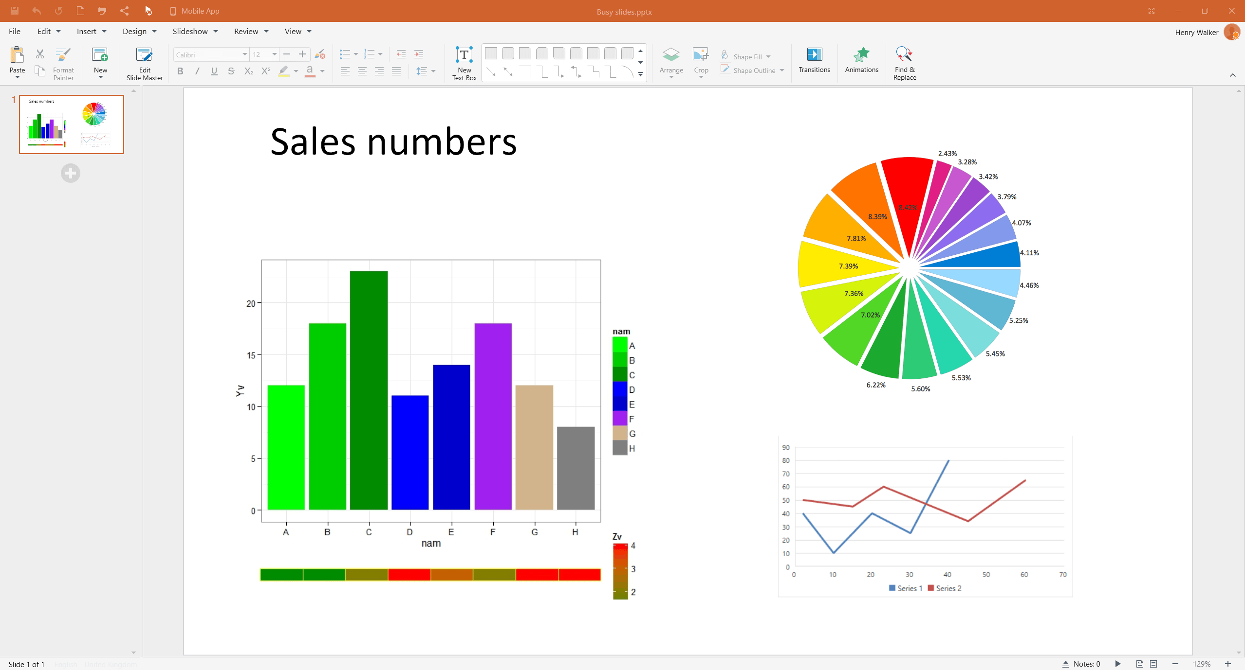
Presentations come with the advantage of having space for images, charts, tables and so on. Not only will they help bring different colours and shapes to the content, they will break up the text and keep attention spans as high as possible. Keep in mind that any visuals you use are of high-quality, well-sized, and properly aligned with the content. As stated by The Presentation Training Institute, visual content has a lasting impact on the audience’s memory. Three hours later, they can recall 85% of what they saw, compared to 70% of what they heard. Three days later, the gap widens: 60% vs. 10%.

Stay consistent
Consistency in design elements across slides creates a cohesive and professional visual identity. Use a consistent color scheme, typography, and slide layout throughout your presentation to keep things looking smooth. Consider utilizing Master Slides or templates to ensure consistent formatting and design across all slides.
Remember visual hierarchy
Establish a clear visual hierarchy to guide your audience’s attention and emphasize key points. Use font size, bolding, color contrast, and layout to distinguish between headings, subheadings, and body text to make sure that the information flow is logical and easily digestible.
Tell a story
This one is a bit of a cliché, but is still important! Structure your slides in a narrative format that begins with an attention-grabbing introduction, presents supporting information, and concludes with a memorable takeaway. Remember to use common storytelling techniques, anecdotes, and examples to make your content relatable and engaging.
Practice and keep time
One of the most important things ahead of your presentation is to practice, practice, practice. Make sure your slides flow smoothly and fit within your time limit. Nobody wants a presentation to go on forever, so keep a decent pace and remember to leave room for questions and discussion at the end.
Use white space
White space is the empty space on your slides, which you shouldn’t consider as ‘wasted’. It makes your slides easier to read, gives them a clean look, and highlights the important parts. Don’t cram your slides with too much information, as this will end up being confusing or distracting.

Know your audience
Think about who you are talking to and what they need to know. Do they like deep dives into data, or do they prefer to know the headlines only. Use phrases and visuals that they can understand and relate to, with plenty of examples and references that matter to them.
Connect with the audience
If appropriate, make your presentation fun and interactive (within reason). Ask questions, do polls, or use other features to get your audience involved. You can also use slides to start group discussions, brainstorming sessions, or reflection exercises. Here’s a fantastic resource from Icebreaker Speech on how to connect with audiences before and during a presentation.
Get feedback
Every presentation is a chance to grow and get better, so if its an internal presentation, ask for feedback to find out what worked, and what didn’t. If you’ve been working on it for too long, you’ll not notice mistakes, or sections that can be edited down, so if you can, get feedback before the presentation itself to make sure it’s as good as it can be.
2. The dont’s
Only rely on text
MobiSlides can do more than show words: They can also show images, videos, audio clips, or animations that make your presentation more exciting and memorable. Use different media to appeal to different senses and make your presentation more lively and varied, or risk losing the attention of your audience.
Forget to proofread and edit
Even if you’re proofread your presentation 12 times, there will still likely be typos or formatting errors that can be embarrassing when shown in front a bunch of people – especially if they are clients, or you’re doing a job interview task. After using spellcheck and the usual tools to check it, ask someone else to give it a good read as well. They will have fresh eyes and will be much better placed to spot any problems you missed.
Overwhelm with too much data
Resist the temptation to include every detail on your slides, and instead focus on key points, essential data, and impactful visuals. Your slides should provide a framework for your narrative, prompting discussion and elaboration, rather than bombarding your audience with too much data. If needed, you can print and hand out supplementary materials that go into more depth.

Overuse bullet points
Bullet points can be handy for listing key facts, but they can also be boring and dull when used slide after slide. Mix it up with short sentences, impact statements, quotes, images, charts and infographics. Otherwise, you might as well be showing them a completely plain and unworked word document.
Read from your slides
Your slides are there to help you, not do all the work. Don’t just read what’s on the screen or use your slides as a script. Instead, look at your audience and talk to them, using the slides as visual guides and summaries of the information you want to get across.
Forget about readability
Readability is paramount in effective slide design, so avoid using small fonts or complex typefaces are difficult to read. Stick to legible fonts, and ensure a sufficient contrast between the text and the background – for instance, yellow text on a white background.
Overload the text
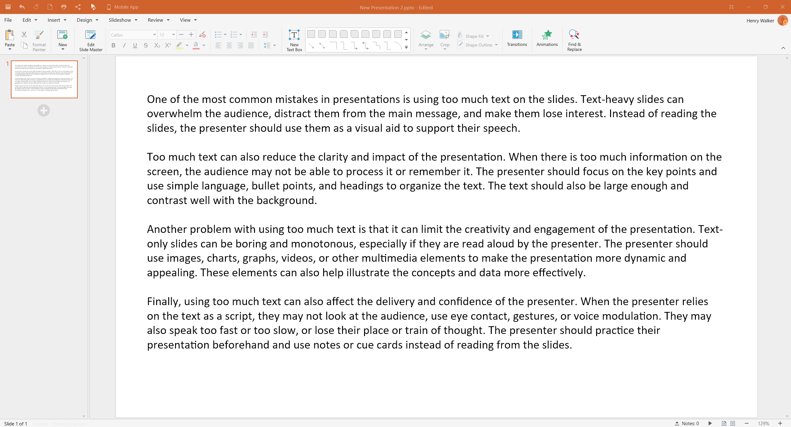
One common mistake is cramming slides with excessive text that goes on for paragraphs. Instead, use concise and impactful phrases or keywords to convey your message, with any extra information being expressed verbally.

Overuse Transitions Or Animations
While animations and slide transitions can add visual interest, excessive use can be distracting and detract from your message. Opt for subtle and purposeful animations that enhance the flow and comprehension of your content, instead of having your words and images spin, zoom or bounce into view.
Use low-quality graphics
Low-resolution images, pixelated graphics, and stretched visuals can detract from the professionalism of your slides. Invest time in finding high-quality visuals or create custom graphics to maintain a polished appearance. Also, avoid using using clip art or generic stock images, as these can be easily spotted, lessening the impact of your work
You’re good to go
A good presentation can go a long way if done correctly. Of course, the human element of nerves plays its part, but if you know that you have a great deck, it will help with your confidence, and will get your messages across in engaging and professional ways. All of the above presentation do’s and don’ts can be achieved with MobiSlides, built to create beautiful presentations, allowing you to easily create decks that get the job done, and then some.


