קורות חיים מודרניים צריכים להיראות נקיים, מקצועיים וקלים לסריקה, עם כותרות ברורות לכל חלק, עיצוב אחיד, גופנים קריאים ושימוש מושכל ברווח לבן. ב-2026 מעסיקים מצפים לקורות חיים שמשלבים מראה נעים עם תאימות למערכות לסינון מועמדים (ATS), ומעדיפים עיצוב פשוט על פני גרפיקה מורכבת.
מאמר זה עודכן ב-22 באוקטובר 2026
המדריך הזה מראה איך קורות החיים שלכם צריכים להיראות היום: תקני פריסה, דרישות עיצוב וציפיות עיצוביות לשלבי קריירה שונים. תלמדו מה מעסיקים רוצים לראות, מאילו טעויות להימנע ואיך ליצור קורות חיים שבולטים.
איך קורות חיים צריכים להיראות היום?
קורות חיים מודרניים צריכים להתמקד בבהירות, במבנה ובקריאות. פריסה נקייה עוזרת למגייסים לסרוק במהירות את הניסיון שלכם, ומבטיחה שקורות החיים יעבדו טוב עם מערכות לסינון מועמדים (ATS).
כשמעצבים קורות חיים, כדאי לפעול לפי ההנחיות המעשיות האלה:
טיפוגרפיה וטקסט
השתמשו בגופנים סטנדרטיים כמו Arial, Calibri או Helvetica
שמרו על גודל גופן של 10 עד 12 נקודות בטקסט הרגיל
הדגישו את השם ואת כותרות החלקים כדי שהמידע החשוב יבלוט
פריסה ומרווחים
השאירו שוליים של כ-2.5 ס"מ מכל הצדדים
השתמשו במרווח שורה יחיד בתוך החלקים והוסיפו רווח נוסף בין החלקים
ישרו את רוב הטקסט לצד אחד כדי להקל על המגייסים לסרוק אותו
מבנה ותוכן
השתמשו בתבליטים באופן עקבי לפירוט הישגים ותחומי אחריות
בחרו ערכת צבעים פשוטה, עם צבע הדגשה אחד או שניים בלבד, כמו כחול כהה, אפור כהה או גוונים מקצועיים של כחול
הימנעו מתמונות, והשתמשו בסמלים רק כשהם באמת משפרים את הבהירות ולא מעמיסים על הפריסה.
ולבסוף, שמרו על עיצוב מאופק. קורות החיים צריכים להוביל את עין הקורא בצורה חלקה דרך הכישורים, ההישגים והמסלול המקצועי שלכם, בלי הרבה רעש חזותי.
איך קורות חיים מקצועיים צריכים להיראות?
קורות חיים מקצועיים צריכים להיראות מלוטשים ומתאימים לתחום: עיצוב מסורתי לתפקידים בחברות, ופריסות קצת יותר יצירתיות לתפקידים בעיצוב או בשיווק.
לדוגמה:
השתמשו בהיררכיה ברורה שבה השם בולט
אחריו פרטי קשר, תקציר מקצועי, ניסיון תעסוקתי, השכלה וכישורים רלוונטיים.
הדגישו הישגים יותר מתחומי אחריות.
בנוסף, הקפידו על עיצוב אחיד, כך ששמות החברות, התפקידים, המיקומים והתאריכים ייושרו באותה צורה לאורך כל המסמך.
קורות חיים לחברות לעומת קורות חיים יצירתיים
קורות חיים לתפקידים בפיננסים, במשפטים, בייעוץ ובעסקים מסורתיים צריכים להיראות שמרניים: טקסט שחור, מעט צבע, גופנים סטנדרטיים ופריסות מקובלות. קורות חיים יצירתיים לשיווק, לעיצוב או למדיה מאפשרים יותר אישיות, עם שימוש עדין בצבע, גופנים עכשוויים ורכיבים חזותיים מחושבים שמראים חוש עיצובי.
Modern resume vs. traditional resume
Modern resumes balance visual appeal with functionality, using subtle design elements, strategic white space, and skills-based sections. Traditional resumes stick to chronological work history with minimal formatting and completely text-based content. Modern formats work better for applicant tracking systems when designed with simplicity.
The best approach combines modern readability with traditional structure. Clear section headings, consistent formatting, and scannable bullet points represent modern improvements over dense paragraph-heavy traditional styles, while maintaining the professional standards employers expect.
What should a resume look like for students and beginners?
Resumes for students and early-career candidates should focus on education, skills, and practical experience gained outside traditional jobs.
In most cases, students should lead with the education section rather than work experience. Academic achievements, relevant coursework, and hands-on projects can help show employers what you can do.
The overall design should remain simple and professional. Many students make the mistake of choosing overly creative templates that reduce readability. Clean layouts with clear sections help recruiters quickly understand your strengths. For most students and recent graduates, a one-page resume is the standard, unless you have significant research experience or publications.
High school student resumes
High school student resumes should be especially clear and accomplishment-focused.
Strong high school resumes often include:
GPA if it is strong
Relevant coursework
School clubs and extracurricular activities
Volunteer work or community service
Part-time or seasonal jobs
Leadership roles in clubs, sports achievements, and community involvement can help demonstrate initiative, teamwork, and responsibility.
Resumes with no work experience
If you have no formal work experience, your resume should focus on skills and demonstrated abilities rather than job history. Instead of listing previous positions, highlight activities that show initiative, responsibility, and practical knowledge.
This may include:
Academic projects
Relevant coursework
Certifications or online training
Volunteer work
Personal or independent projects
Organize these experiences into clear sections and frame them around transferable skills such as communication, organization, problem-solving, and technical abilities.
What should a resume summary look like?
A resume summary should look like a 2-3 sentence statement at the top of your resume, immediately below contact information. It should highlight your professional identity, years of experience, key skills, and the value you bring, tailored specifically to the position you're targeting.
Key elements to include:
Your professional title or area of expertise
Years of relevant experience
2-3 core skills or competencies
Quantifiable achievement or specific value you bring
How your background aligns with the target tole
What to avoid:
Generic statements like “hardworking professional seeking opportunities”
First-person pronouns (I, me, my)
Listing job duties instead of achievements
Making it longer than 3-4 sentences or bullet points
What should references look like on a resume?
References should not appear on your resume in 2026. Instead, prepare a separate references document to provide when requested. Simply note "References available upon request" at the bottom of your resume or omit reference mention entirely to save valuable space for qualifications.
When creating a separate references document:
List 3-5 professional contacts
Include full name, title, company, phone number, and email addresses
Add a brief note about your relationship, like "Direct supervisor at Company X"
Format the document with clear spacing and alignment
Best practices:
Always ask permission before listing someone as a reference
Inform your references when you're activle job searching
Choose people who can speak specifically to your relevant skills
Update contact information regularly to ensure accuracy
Common resume design mistakes to avoid
Avoid design choices that reduce readability, confuse applicant tracking systems, or appear unprofessional. Simple, clean formatting always outperforms elaborate designs.
Design mistakes to avoid:
Using multiple fancy or decorative fonts
Including photos unless required
Cramming too much text without white space
Adding elaborate graphics or clip art
Creating inconsistent formatting across sections
Choosing tiny fonts below 10 points
Using tables or text boxes that confuse ATS software
Selecting busy backgrounds or patterns
Content and formatting mistakes:
Using unprofessional email addresses
Listing outdated or irrelevant skills
Including unnecessary personal information
Making resumes too long without justification
Forgetting to proofread for spelling and grammar errors
Saving in incompatible or unusual file formats
MobiOffice helps you avoid these pitfalls with user-friendly document templates and formatting tools that work intuitively. Create, edit, and save professional resumes easily with familiar controls and compatible file formats.
Build your resume with confidence.
כדאי להשתמש בתבנית לקורות החיים?
כן, שימוש בתבנית מקצועית יכול לחסוך לכם זמן ולהבטיח שקורות החיים שלכם ייראו מעולים כבר מההתחלה. תבניות מציעות מבנה מוכח, עיצוב אחיד וריווח נכון, ללא צורך בידע בעיצוב או בשעות של התאמות ידניות.
MobiDocs מציע תבנית קורות חיים ומכתב מקדים מוכנה לשימוש, שנראית מקצועית ושומרת על הפורמט הנקי והקריא שמעסיקים מצפים לראות. התבנית פועלת ברוב המכשירים ונשמרת בפורמטים תואמים.
איך להשתמש בתבנית קורות החיים והמכתב המקדים ב-MobiDocs:
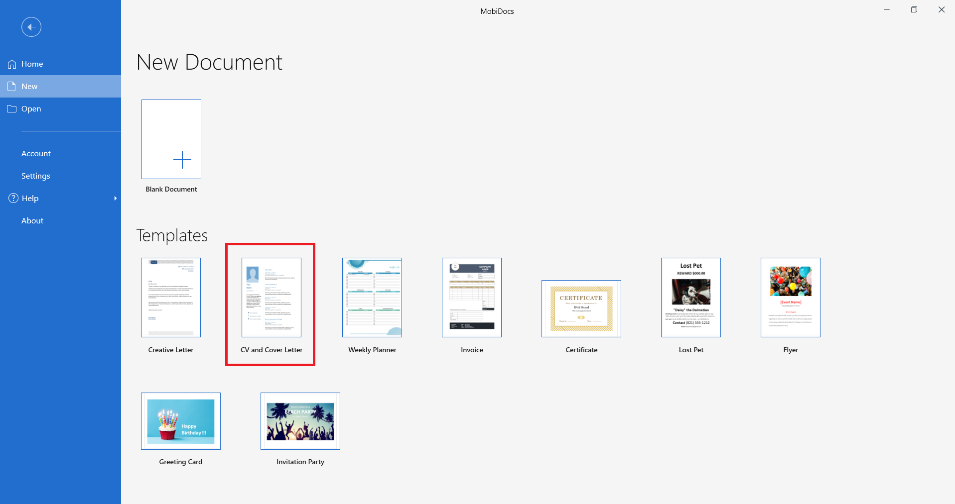
פותחים את MobiDocs.
בוחרים ב-CV and Cover letter תחת Templates, ולוחצים על Create.
מחליפים את הטקסט הזמני בפרטים שלכם.
משתמשים בתבנית המכתב המקדים התואמת כדי ליצור תיק פנייה אחיד ומגובש.
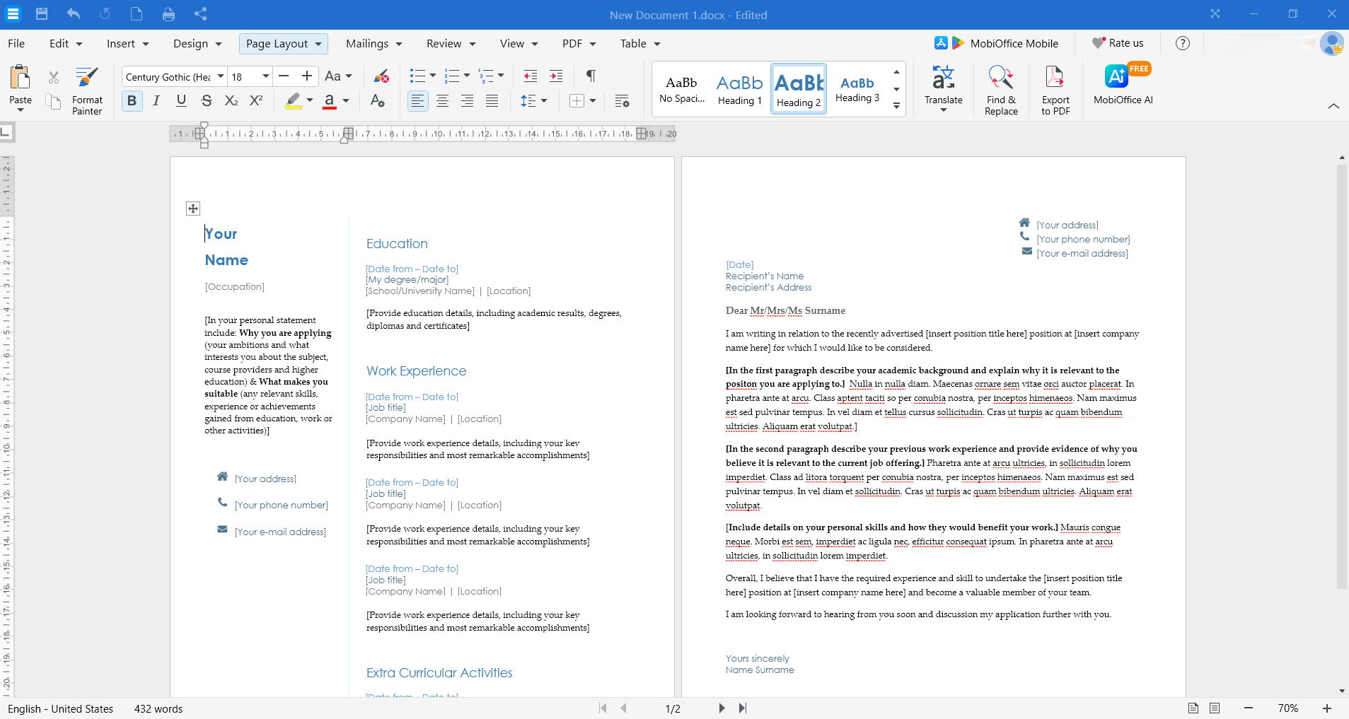
מתאימים את העיצוב, הצבעים והסעיפים לפי הצרכים שלכם.
שומרים את קורות החיים כקובץ PDF או Word.
שאלות נפוצות
איך קורות חיים צריכים להיראות ב-2026?
ב-2026, קורות חיים צריכים להיראות נקיים וקריאים לסריקה מהירה, עם גופן מקצועי אחד או שניים, נגיעות צבע עדינות, כותרות סעיפים ברורות, עיצוב עקבי ומספיק רווח לבן.
האם קורות החיים צריכים להיות באורך עמוד אחד?
קורות חיים צריכים להיות בעמוד אחד עבור סטודנטים, בוגרים טריים ואנשי מקצוע עם פחות מ-10 שנות ניסיון. שני עמודים מתאימים לאנשי מקצוע בכירים, לאנשי אקדמיה או למי שיש להם ניסיון רלוונטי עשיר.
איך צריכים להיראות קורות חיים ללא ניסיון?
קורות חיים ללא ניסיון צריכים להדגיש השכלה, כישורים, קורסים, פרויקטים, התנדבות ויכולות שניתן להעביר לתפקיד. כדאי לשמור על פורמט פשוט ומקצועי שמתמקד בהישגים.
האם PDF הוא עדיין הפורמט הטוב ביותר לקורות חיים?
פורמט PDF נשאר הפורמט הטוב ביותר לרוב הגשות קורות החיים, כיוון שהוא שומר על העיצוב במכשירים ובמערכות שונות. עם זאת, חלק ממערכות מעקב המועמדים (ATS) מעדיפות מסמכי Word.
איך צריך להציג ממליצים בקורות החיים?
עדיף לא לכלול ממליצים ישירות בתוך קורות החיים. כדאי ליצור מסמך ממליצים נפרד שאותו תוכלו להעביר לפי דרישה, או פשוט לציין "ממליצים יימסרו לפי דרישה" בתחתית העמוד אם המקום מאפשר זאת.
יצירת קורות חיים שנראים מקצועיים ומודרניים לא דורשת תוכנות יקרות או מומחיות בעיצוב. MobiOffice מספק את כל מה שדרוש כדי לבנות, לערוך ולשכלל את קורות החיים שלכם עם כלים פשוטים לשימוש ופורמטים תואמים. הורידו את MobiOffice עוד היום והספיקו יותר עם יישומי משרד שמיועדים לעבודה ולחיים.