This article was updated on March 25, 2026
A modern resume should look clean, professional, and easy to scan, with clear section headings, consistent formatting, readable fonts, and strategic use of white space. In 2026, employers expect resumes that balance visual appeal with applicant tracking system (ATS) compatibility, favoring simple designs over-elaborate graphics.
This guide shows you how your resume should look today, covering layout standards, formatting requirements, and design expectations for different career stages. You'll learn what employers want to see, what mistakes to avoid, and how to create a resume that gets noticed.
What should a resume look like today?
Modern resumes should focus on clarity, structure, and readability. A clean layout helps hiring managers quickly scan your experience while also ensuring your resume works well with applicant tracking systems (ATS).
When formatting your resume, follow these practical guidelines:
Typography and text
Use standard fonts such as Arial, Calibri, or Helvetica
Keep the font size between 10 and 12 points for body text
Bold your name and section headings to make key information stand out
Layout and spacing
Keep one-inch margins on all sides
Use single-line spacing within sections and add extra space between sections
Left-align most text to make scanning easier for recruiters
Structure and content
Use bullet points consistently to list accomplishments and responsibilities
Choose a simple color scheme, limiting yourself to one or two accent colors such as navy, dark gray, or professional blues
Avoid adding photos and only use icons when they genuinely improve clarity rather than clutter the layout.
Finally, keep the design restrained. A resume should guide the reader’s eye smoothly through your skills, achievements, and career story without much visual noise.
What should a professional resume look like?
A professional resume should look polished and industry-appropriate, with traditional formatting for corporate roles and slightly more creative layouts for design or marketing positions.
For example:
Use a clear hierarchy with your name prominent
Follow by contact information, professional summary, work experience, education, and relevant skills.
Emphasize accomplishments over duties.
To top it off, try and format consistently with company names, job titles, locations, and dates aligned the same way throughout.
Corporate vs. creative resumes
Corporate resumes for finance, law, consulting, and traditional business roles should look conservative with black text, minimal color, standard fonts, and conventional layouts. Creative resumes for marketing, design, or media positions allow more personality through subtle color use, contemporary fonts, and thoughtful visual elements that demonstrate design sense.
Modern resume vs. traditional resume
Modern resumes balance visual appeal with functionality, using subtle design elements, strategic white space, and skills-based sections. Traditional resumes stick to chronological work history with minimal formatting and completely text-based content. Modern formats work better for applicant tracking systems when designed with simplicity.
The best approach combines modern readability with traditional structure. Clear section headings, consistent formatting, and scannable bullet points represent modern improvements over dense paragraph-heavy traditional styles, while maintaining the professional standards employers expect.
What should a resume look like for students and beginners?
Resumes for students and early-career candidates should focus on education, skills, and practical experience gained outside traditional jobs.
In most cases, students should lead with the education section rather than work experience. Academic achievements, relevant coursework, and hands-on projects can help show employers what you can do.
The overall design should remain simple and professional. Many students make the mistake of choosing overly creative templates that reduce readability. Clean layouts with clear sections help recruiters quickly understand your strengths. For most students and recent graduates, a one-page resume is the standard, unless you have significant research experience or publications.
High school student resumes
High school student resumes should be especially clear and accomplishment-focused.
Strong high school resumes often include:
GPA if it is strong
Relevant coursework
School clubs and extracurricular activities
Volunteer work or community service
Part-time or seasonal jobs
Leadership roles in clubs, sports achievements, and community involvement can help demonstrate initiative, teamwork, and responsibility.
Resumes with no work experience
If you have no formal work experience, your resume should focus on skills and demonstrated abilities rather than job history. Instead of listing previous positions, highlight activities that show initiative, responsibility, and practical knowledge.
This may include:
Academic projects
Relevant coursework
Certifications or online training
Volunteer work
Personal or independent projects
Organize these experiences into clear sections and frame them around transferable skills such as communication, organization, problem-solving, and technical abilities.
What should a resume summary look like?
A resume summary should look like a 2-3 sentence statement at the top of your resume, immediately below contact information. It should highlight your professional identity, years of experience, key skills, and the value you bring, tailored specifically to the position you're targeting.
Key elements to include:
Your professional title or area of expertise
Years of relevant experience
2-3 core skills or competencies
Quantifiable achievement or specific value you bring
How your background aligns with the target tole
What to avoid:
Generic statements like “hardworking professional seeking opportunities”
First-person pronouns (I, me, my)
Listing job duties instead of achievements
Making it longer than 3-4 sentences or bullet points
What should references look like on a resume?
References should not appear on your resume in 2026. Instead, prepare a separate references document to provide when requested. Simply note "References available upon request" at the bottom of your resume or omit reference mention entirely to save valuable space for qualifications.
When creating a separate references document:
List 3-5 professional contacts
Include full name, title, company, phone number, and email addresses
Add a brief note about your relationship, like "Direct supervisor at Company X"
Format the document with clear spacing and alignment
Best practices:
Always ask permission before listing someone as a reference
Inform your references when you're activle job searching
Choose people who can speak specifically to your relevant skills
Update contact information regularly to ensure accuracy
Common resume design mistakes to avoid
Avoid design choices that reduce readability, confuse applicant tracking systems, or appear unprofessional. Simple, clean formatting always outperforms elaborate designs.
Design mistakes to avoid:
Using multiple fancy or decorative fonts
Including photos unless required
Cramming too much text without white space
Adding elaborate graphics or clip art
Creating inconsistent formatting across sections
Choosing tiny fonts below 10 points
Using tables or text boxes that confuse ATS software
Selecting busy backgrounds or patterns
Content and formatting mistakes:
Using unprofessional email addresses
Listing outdated or irrelevant skills
Including unnecessary personal information
Making resumes too long without justification
Forgetting to proofread for spelling and grammar errors
Saving in incompatible or unusual file formats
MobiOffice helps you avoid these pitfalls with user-friendly document templates and formatting tools that work intuitively. Create, edit, and save professional resumes easily with familiar controls and compatible file formats.
Build your resume with confidence.
履歴書にテンプレートを使うべきか?
はい、プロ仕様のテンプレートを使うと時間を節約でき、最初から洗練された履歴書に仕上げられます。テンプレートには実績ある構成、統一されたフォーマット、適切な余白が備わっており、デザインの専門知識や長時間の手作業による調整は不要です。
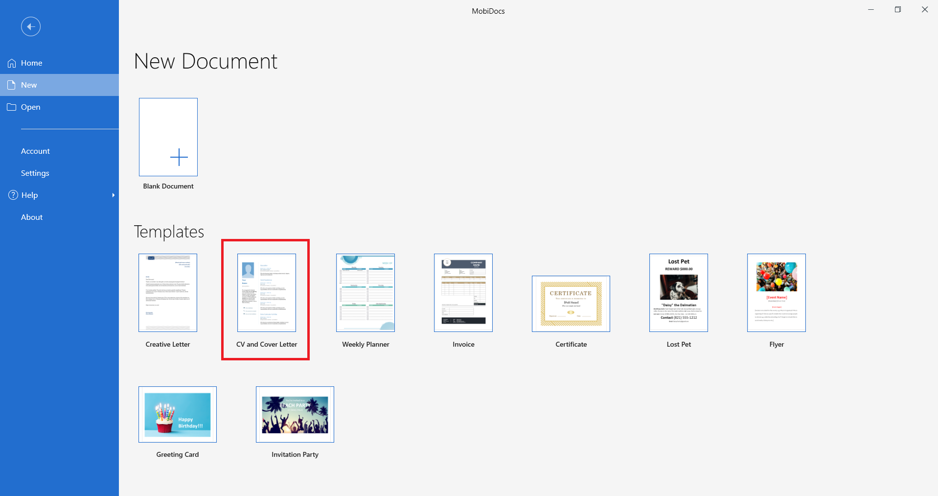
MobiDocs では、すぐに使える 履歴書・カバーレターのテンプレート をご用意しています。採用担当者が期待するクリーンでスキャンしやすいフォーマットで、プロフェッショナルな印象を与えます。テンプレートはほとんどのデバイスで動作し、互換性のある形式で保存できます。
MobiDocsの履歴書・カバーレターテンプレートの使い方:
MobiDocsを開きます。
テンプレートからCVとカバーレターを選択し、作成をクリックします。
プレースホルダーのテキストをご自身の情報に置き換えます。
対応するカバーレターテンプレートを使って、まとまりのある応募書類セットを作成します。
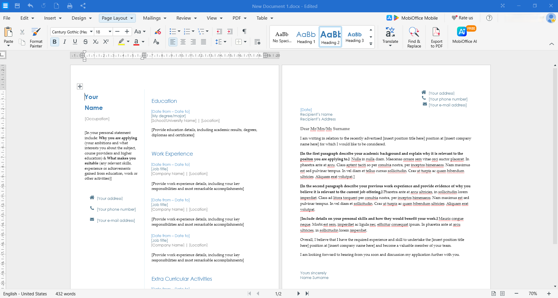
フォーマット、色、セクションをニーズに合わせてカスタマイズします。
履歴書をPDFまたはWordドキュメントとして保存します。
よくある質問
2026年の履歴書はどのような見た目にすべきか?
2026年の履歴書は、1〜2種類のプロフェッショナルなフォント、控えめなカラーアクセント、明確なセクション見出し、統一されたフォーマット、十分な余白を備えた、クリーンでスキャンしやすいデザインが理想的です。
履歴書は1ページにすべきか?
学生、新卒者、経験年数10年未満の方は1ページが適切です。シニアプロフェッショナル、研究者、または豊富な関連経験をお持ちの方は2ページでも問題ありません。
経験がない場合、履歴書はどのような見た目にすべきか?
経験がない場合は、学歴、スキル、履修科目、プロジェクト、ボランティア活動、応用可能な能力を重点的に記載します。シンプルでプロフェッショナルな、成果を意識したフォーマットを心がけましょう。
PDFは今でも履歴書の最適な形式か?
PDFは、異なるデバイスやシステム間でもフォーマットが保持されるため、ほとんどの履歴書提出において最適な形式です。ただし、一部の採用管理システムではWordドキュメントが推奨される場合があります。
履歴書に参照先(リファレンス)はどのように記載すべきか?
参照先は履歴書に記載しないことをおすすめします。求められた際に提供できるよう、別途リファレンス用の書類を用意するか、スペースがあれば「リクエストに応じてリファレンスをご提供できます」と末尾に記載するだけで十分です。
プロフェッショナルでモダンな履歴書を作成するために、高価なソフトウェアやデザインの専門知識は必要ありません。 MobiOffice なら、使いやすいツールと互換性のあるファイル形式で、履歴書の作成・編集・仕上げに必要なすべてが揃っています。今すぐ MobiOfficeをダウンロード して、仕事にも日常にも役立つオフィスアプリをお試しください。